No-Fail Tips for How to Choose Paint Colors
Home painting can be very complicated and exhausting for common households like us. But with the right choice and guide, home painting can be so much fun.
1. Don’t Choose Paint First!
I know it sometimes seems like you should choose your paint color first because painted walls make up a lot of the decor space in your home. But it’s far easier to choose one of thousands of paint colors to go with your other decor, than it is to find decor to go with a paint color.
2. Use an Inspiration Piece
So, if you don’t choose your paint color first, what do you do?
Well, you use an inspiration piece to draw your colors from.
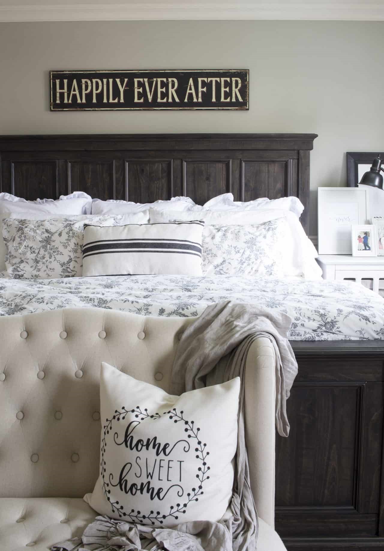
In How to Create a Whole Home Color Palette, I told you that the best hack for choosing your colors including paint colors is to pull them from a multi-colored sofa, a bedspread, a piece of art or even a piece of fabric that you love.
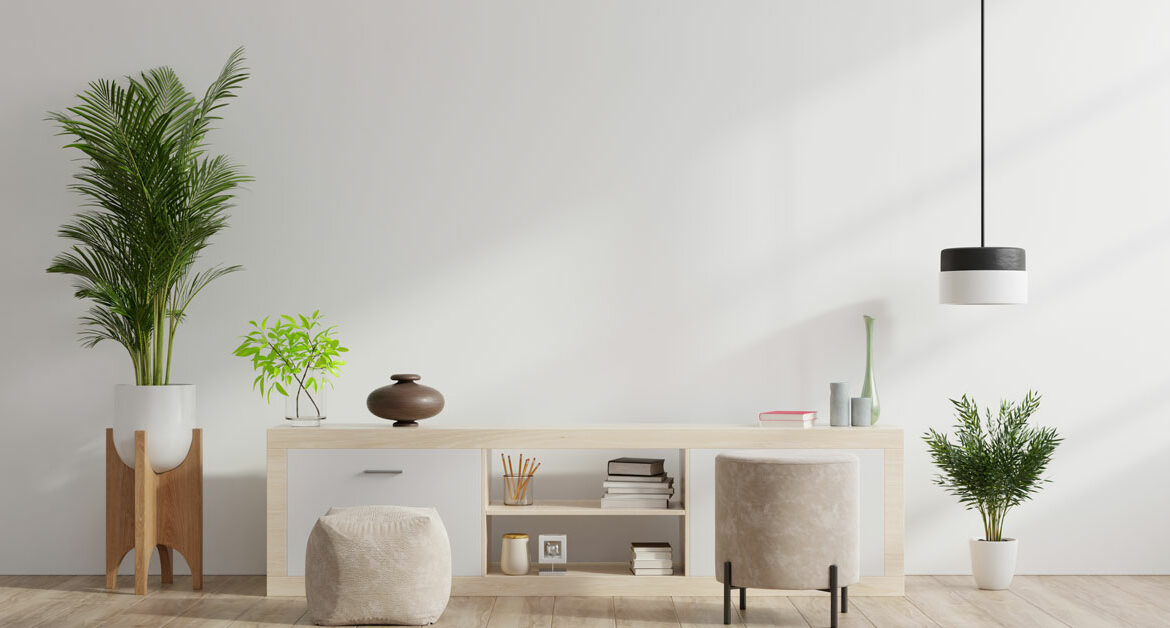
3. Go with Neutrals for Walls
If you love color, you may want to use bold, beautiful pops of color on your walls. But, for most of us it’s best to keep the walls neutral and use those bold pops of color to accents and accessories.
I recommend going with neutral walls for a few reasons:
- If your walls are neutral, your attention is on the furniture and accent pieces rather than on the walls. Which is definitely what you want!
- If your walls are neutral, you can change out the accent pieces easily if you change your mind on the colors you like. It does happen!
- Neutral-colored walls also make it really easy to swap out your decor with the seasons, or even just add holiday and seasonal touches.
- Medium toned neutral walls are good for families, because they hide scuffs and dirt quite well!
4. Understand Undertones
The reason your walls may not look like you envisioned them after painting them, is because all paint colors are made up of other colors and have something called an undertone that is either warm or cool.
A warm paint color will have a base color (undertone) of a warm color, such as yellow or red.
A cool paint color will have a base color (undertone) of a cool color, like blue, green or grey.
5. Use the Largest Test Swatch Possible & Test At Home, With Accurate Lighting
After you’ve chosen a few possible paint colors, pick up the largest paint swatches that your store has and bring them home. Or get sample-sized testers and paint them onto bristol boards so you can move them around your space.
Look at the large samples in all kinds of light, at different times of day, in different parts of the room. Look at them next to the couch, the rug, and the art.
Lighting will affect how your paint colors look in your home, and may even make the same color look different in one room than the next. The larger the swatch, the easier it will be to determine which paint color looks best in your space.
- South-facing rooms tend to have slightly warmer light, due to the sun coming in all day. Which means that the natural lighting will be a yellow-white light and may wash out colors, at least a little. Even still, most paint colors can work in a room with southern exposure, but a cooler color may be preferred to balance the yellower lighting.
- North-facing rooms will have a cooler, blue or grey natural lighting. For these spaces, you can use a cool color, but it may seem even cooler and more blue-grey and chilly than it would in another room. A warm paint color is preferable in a room with northern exposure.
- East- and west-facing rooms will have either warm or cool lighting, depending on the time of day. So, you could use either warm or cool paint colors in rooms with eastern and western exposure.
6. Choose the Right Paint Type – Paint Sheens
Another thing that affects how your paint color will look is the sheen. In general, the higher the sheen the easier it is to keep clean. Unfortunately, the higher the sheen, the more it will show imperfections in a space. So, if you’re trying to hide any flaws in your walls, go with a lower sheen.
- Gloss will be highly wipeable and easiest to clean, but is way too shiny for walls. Gloss is good for baseboards, trim and sometimes cabinets.
- Semi-gloss will be almost as easily cleaned, with significantly less shine, although it’s not good on walls in large spaces. Semi-gloss is great for trim, cabinets and high moisture areas, like bathrooms.
- I would suggest a satin finish for use on walls higher traffic areas like hallways and kids rooms. Satin finish paint is also good for bathrooms, because it’s wipeable.
- High gloss paint is known for being super shiny and light reflecting, giving it an almost mirror-like look. Most designers would consider it a specialty finish, as it creates such a brilliant sheen.
- Flat or matte is best in rooms in which the walls won’t really be touched much, like master bedrooms.
7. Create a Whole Home Color Palette
While you don’t necessarily want to paint your entire home interior all one color, if you want cohesive flow in your home, you really don’t want to be choosing paint colors in isolation or one room at a time with no plan either. You need a whole home color palette. A whole-home color palette will give you guidelines for the overall colors in your home, while giving you the creativity to use those colors in different ways in different rooms.
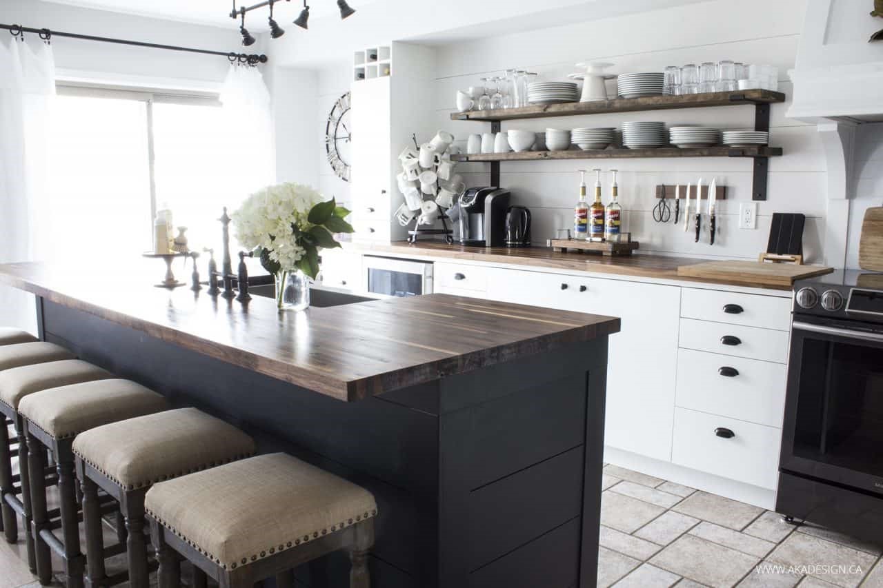
For example, in our house, we have shades of white, greige and black.
But we use those colors in varying proportions in each room.
For instance, in our kitchen we have Eider White on the Walls, Pure White on the trim and range hood (which happens to also very closely match the white Ikea cabinet doors), and black on the island.
In the adjoining living room we have Eider White walls and a white shiplapped fireplace mantel, along with a black accent wall.
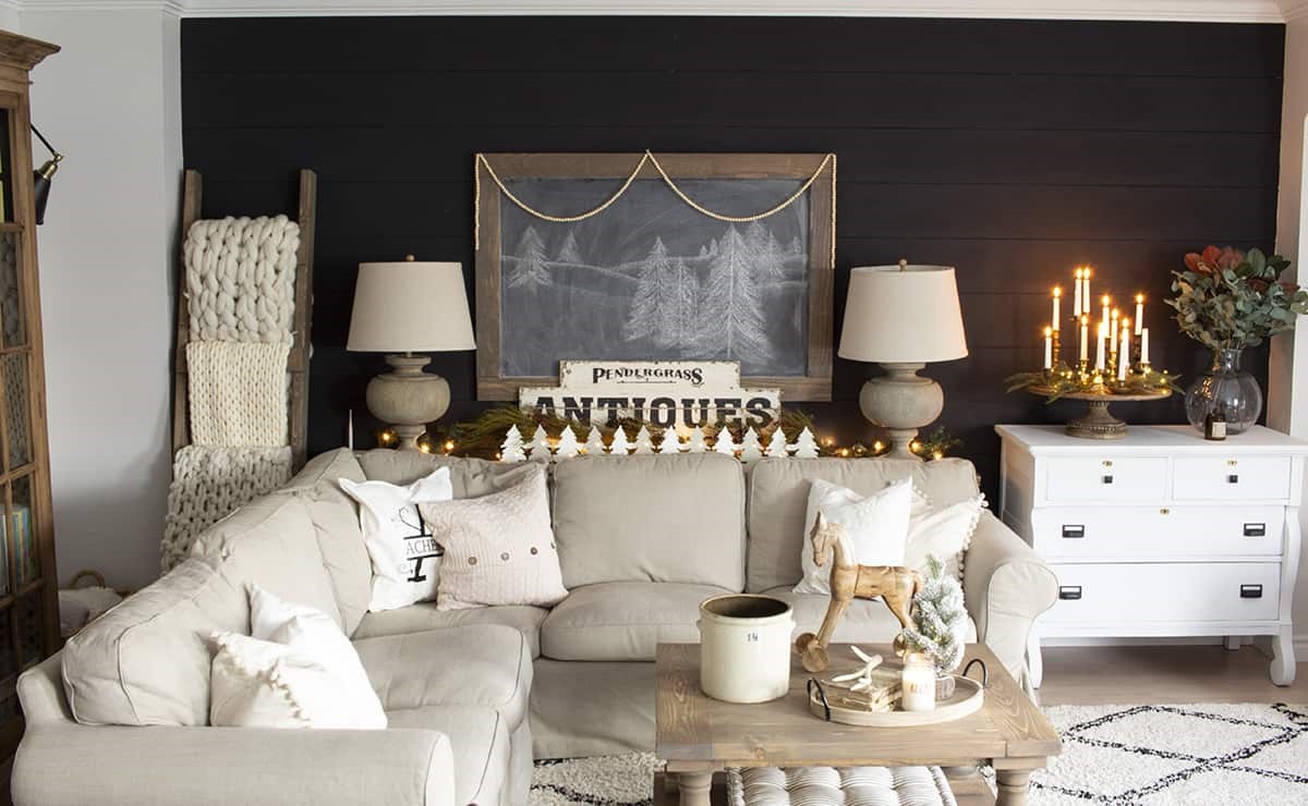
Same paint colors, different placement and proportions. And you can do the same sort of thing in your home with your whole home color scheme.
How Many Paint Colors Should Be in a House?
Well, that depends. The general idea with a whole home color scheme is to have:
- 1 white,
- 1 neutral,
- and 3 other colors
- (plus woods and metals)
Those don’t necessarily have to be paint colors, but rather colors in general. So, the big total is 5 colors, although you can have shades and tints of your main colors as paint colors too.
(Kids’ rooms don’t necessarily have to be included in your whole home color scheme, since they tend to be brighter/more colorful and are quite often based around their own theme.)
What is the Best Paint Color for a Small Living Room?
The best paint color for any small space (living room, bedroom, dining room, kitchen) is one that makes it feel larger and more open. Lighter colors tend to make a room seem larger because they appear to be receding away from you in your mind’s eye. So, consider white, cream, a light greige or even lightened version of your favorite colors like green or blue. You can totally break this guideline for small rooms like bathrooms though!
Conversely, if you want to make a large space feel more cozy, try using warm, darker colors.
So, where do you get those paints in Malaysia? And which shops are selling them in good quality and great after sales service?
Currently, 31Hardware is expanding their business in online platform and their physical stores are available in Klang area. They are running a lot of sales promotion now in their website and the Paint Consultant are very friendly in explaining the colors! Do checkout their paint selections on website and drop them a message in Live Chat.
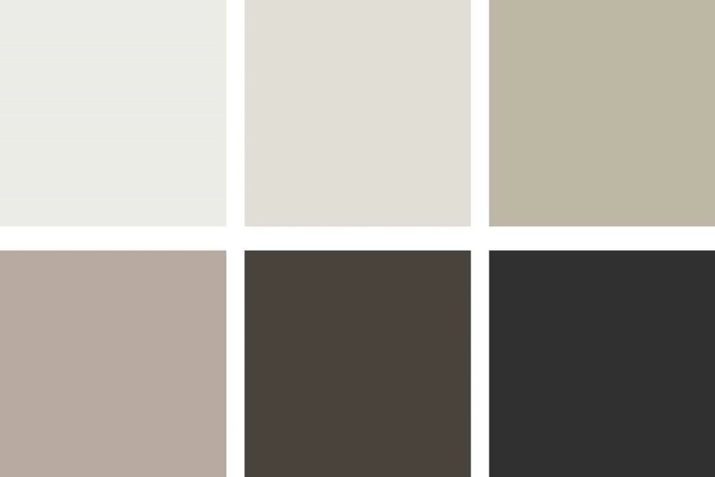
Understanding Paint Swatches
Those lovely long paint swatches you get at the hardware store are super handy for choosing paint colors. But only if you understand them!
Choosing Coordinating Colors
Paint swatches generally have 3 or more colors all in a row. Each swatch is grouped according to color temperature.
So, on one swatch you will have several shades of a color that is either warm or cool. One swatch will NEVER have both warm and cool colors on it.
The more muted the color on the swatch, the more grey has been added. If you stay with the same saturation level and color temperature, you can easily coordinate colors in your space.
- For example, using the swatches below, you could choose a couple of colors from one swatch for a nice, soothing monochromatic look.
- Or you could choose, say the third color down on two different swatches. Doing that, you’d be keeping with the same saturation level, which would provide a lovely coordinating color scheme.
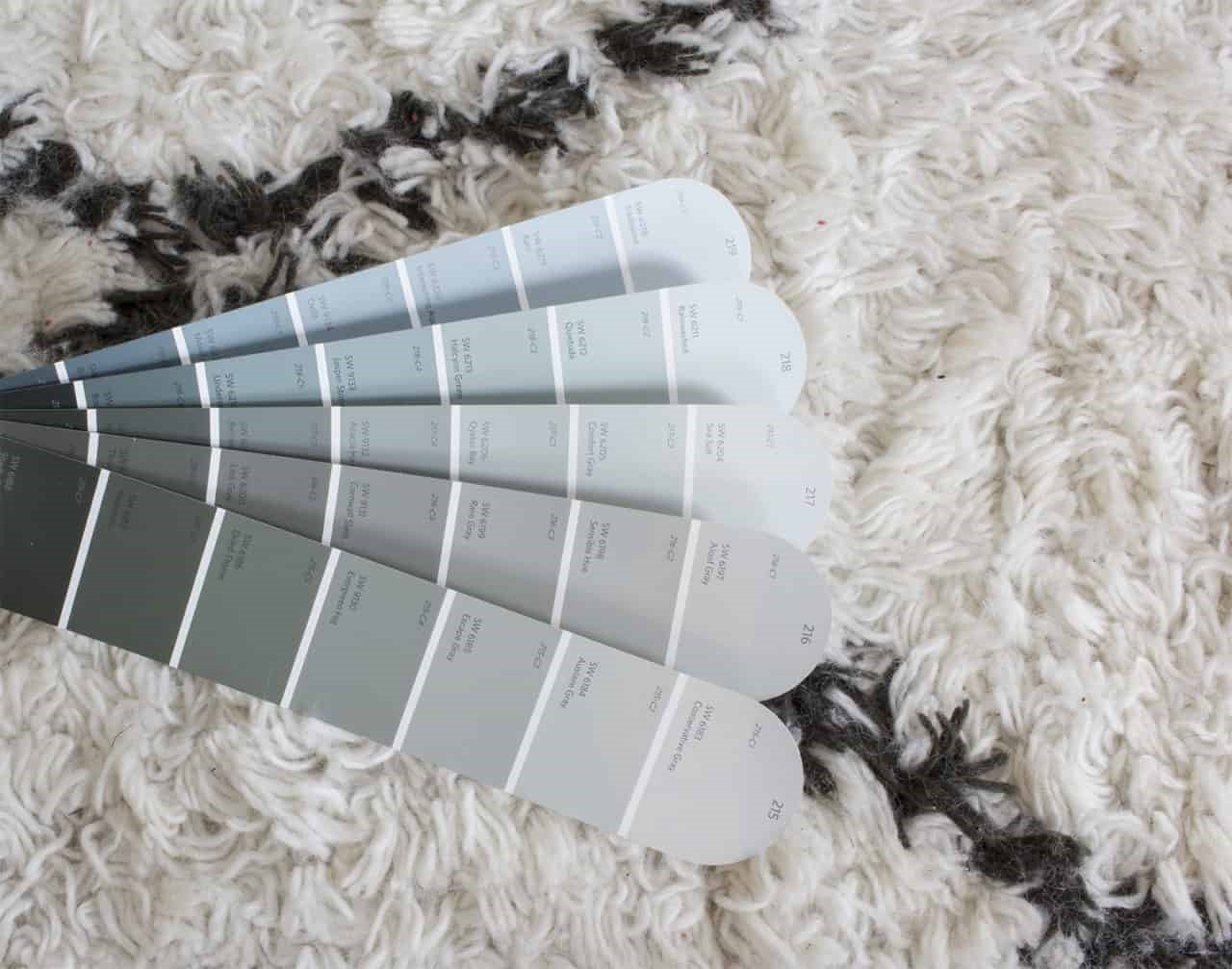
Choosing Whites
To choose whites, stay in the same color temperature zone (warm or cool).
A white near cool colors on a swatch compliment cool colors, while a white near warm colors on a swatch compliment warm colors.
- Keep cool with cool and warm with warm for a monochromatic or analogous color scheme.
- Or if you’re using a complimentary color scheme, mix warm and cool.